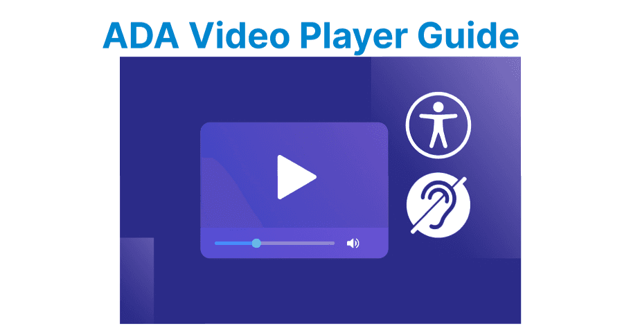
Building ADA-compliant color schemes in Flutter ensures that applications remain accessible to users with visual impairments, meeting legal standards and creating an inclusive user experience. The goal is to design interfaces where text, icons, and media are easy to perceive, maintaining proper contrast and clarity across all parts of the app.
Planning Color Schemes in Flutter
Step 1: Define Base Color Requirements
Start by defining a ColorScheme within ThemeData to enforce ADA compliance across the app. Use tools like the WCAG Contrast Checker or Material Design’s Color Tool to select primary, secondary, and surface colors that meet minimum 4.5:1 contrast ratios for text and 3:1 for UI components.
Organize palettes for light and dark modes, ensuring both pass accessibility checks. For video overlays, plan supplementary colors with higher contrast (e.g., 7:1) to account for dynamic backgrounds. Here’s a basic ColorScheme setup with compliant contrasts:
Example:
ThemeData(
colorScheme: ColorScheme.light(
primary: const Color(0xFF0056B3), // WCAG-compliant blue
onPrimary: Colors.white, // High contrast for text
secondary: const Color(0xFF6C757D),
onSecondary: Colors.white,
surface: const Color(0xFFFFFFFF),
onSurface: const Color(0xFF212529), // Dark gray for readability
background: const Color(0xFFF8F9FA),
),
)
Explanation:
- primary: const Color(0xFF0056B3): Sets the main brand color to a WCAG-compliant blue, used for key UI elements like buttons and highlights.
- onPrimary: Colors.white: Sets the text and icon color that appears on top of primary elements to white for high contrast.
- secondary: const Color(0xFF6C757D): Defines a secondary accent color, typically used for less prominent actions and UI details.
- onSecondary: Colors.white: Sets the text and icon color on top of secondary elements to white for visibility.
- surface: const Color(0xFFFFFFFF): Sets the background color for surfaces like cards and sheets to pure white.
Step 2: Implement Adaptive Themes
For adaptive themes, extend ThemeData to respond to system settings or app state:
bool isDarkMode = context.watch<BrightnessProvider>().isDarkMode;

return MaterialApp(
theme: ThemeData(
colorScheme: isDarkMode ? _darkColorScheme : _lightColorScheme,
),
);
Explanation:
- isDarkMode = context.watch<BrightnessProvider>().isDarkMode: Reads the isDarkMode value from the BrightnessProvider using the context.watch method, so the widget rebuilds when the brightness setting changes.
- theme: ThemeData(...): Sets the theme for the MaterialApp using Flutter’s ThemeData class.
- colorScheme: isDarkMode ? _darkColorScheme : _lightColorScheme: Chooses between _darkColorScheme and _lightColorScheme based on the value of isDarkMode.
Note: Include a separate palette for video UI elements like captions or buttons, ensuring they remain legible over varying video backgrounds.
Implementing ADA-Compliant Colors in Flutter
Step 3: Apply ColorScheme to Widgets
Apply the ColorScheme across widgets using Theme.of(context). For interactive elements, enforce contrast ratios with onPrimary or onSurface colors. Video-centric interfaces require additional layering: use semi-transparent gradients or scrims behind text and controls to maintain readability.
Video players require route-specific theming to adapt UI elements during playback. For example, controls should switch between light/dark variants based on video content brightness.
Container(
decoration: BoxDecoration(
gradient: LinearGradient(
begin: Alignment.bottomCenter,
end: Alignment.topCenter,
colors: [
Colors.black.withOpacity(0.7),
Colors.transparent,
],
),
),
child: const Text(
'Closed captions here',
style: TextStyle(color: Colors.white),
),
)
Explanation:
- decoration: BoxDecoration(...): Applies a BoxDecoration to the container, allowing custom visual styling such as gradients.
- gradient: LinearGradient(...): Creates a vertical gradient background.
- begin: Alignment.bottomCenter: Starts the gradient at the bottom center of the container.
- end: Alignment.topCenter: Ends the gradient at the top center.
- colors:
- Colors.black.withOpacity(0.7): Semi-transparent black at the bottom for better text readability.
- Colors.transparent: Fully transparent at the top for a smooth fade effect.
- child: const Text(...): Displays the text "Closed captions here".
- style: TextStyle(color: Colors.white): Sets the text color to white to contrast against the dark gradient background.
Step 4: Implement Route-Specific Theming
Route-specific theming ensures media-heavy pages like video players prioritize accessibility:
Navigator.push(
context,
MaterialPageRoute(
builder: (context) => Theme(
data: Theme.of(context).copyWith(
colorScheme: _videoScreenColorScheme,
),
child: VideoPlayerScreen(),
),
),
);
Explanation:
- Navigator.push(...): Pushes a new route onto the navigation stack, transitioning the app to a new screen.
- MaterialPageRoute(...): Creates a page route with a Material Design transition animation.
- builder: (context) => Theme(...): Builds the destination widget wrapped in a Theme widget to override theme settings for that screen only.
- child: VideoPlayerScreen(): The main content of the new route, in this case the VideoPlayerScreen widget.
Step 5: Style Accessible Captions
For captions, use TextStyle with high contrast and background padding:
Text(
'Closed captions text',
style: TextStyle(
color: Colors.white,
backgroundColor: Colors.black.withOpacity(0.8),
fontSize: 16,
),
)
Explanation:
- Closed captions text: The string displayed by the Text widget.
- style: TextStyle(...): Defines the appearance of the text.
- color: Colors.white: Sets the text color to white for visibility.
- backgroundColor: Colors.black.withOpacity(0.8): Applies a semi-transparent black background behind the text to improve readability against busy visuals.
- fontSize: 16: Sets the text size to 16 logical pixels for clear legibility.
Testing Color Accessibility in Flutter
Step 6: Automate Contrast Testing
Automate contrast checks using Flutter’s testing framework. Verify ratios with flutter_test and the wcag_contrast package:
test('Verify button contrast ratio', () {
final buttonColor = Colors.blue[600];
final textColor = Colors.white;
final ratio = contrastRatio(buttonColor, textColor);
expect(ratio, greaterThan(4.5));
});
Explanation:
- test('Verify button contrast ratio', () { ... }): Defines a unit test with the description "Verify button contrast ratio".
- final buttonColor = Colors.blue[600]: Sets the button’s background color to a medium-dark shade of blue from the Material color palette.
- final textColor = Colors.white: Sets the button’s text color to white.
- final ratio = contrastRatio(buttonColor, textColor): Calculates the contrast ratio between the button background and text color using the contrastRatio function.
- expect(ratio, greaterThan(4.5)): Asserts that the calculated ratio is greater than 4.5, meeting WCAG AA accessibility guidelines for normal-sized text.