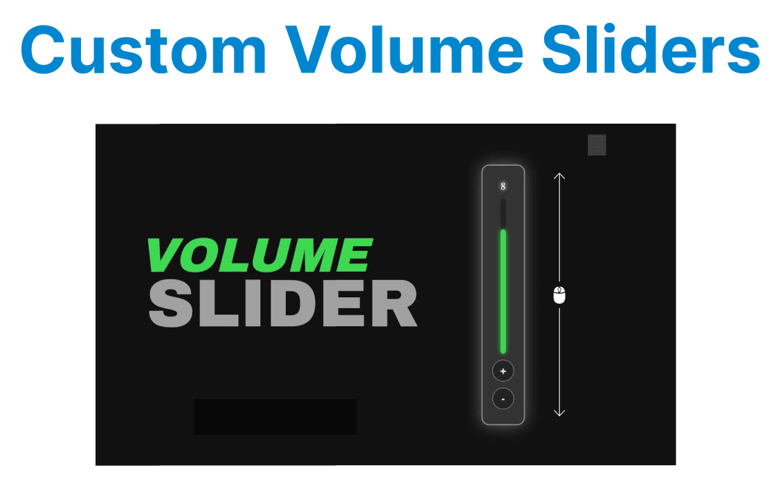
Custom volume sliders and mute buttons provide an enhanced user experience by offering more control over video playback and audio. These controls allow developers to customize the appearance and behavior of audio management beyond the default browser video player controls. Implementing these custom controls involves manipulating the HTML5 video element’s volume property and adding event listeners for interactivity.
Accessing and Setting Video Volume
The volume property of the HTML5 <video> element allows you to control the playback audio level by setting a value between 0 (muted) and 1 (maximum volume). Adjusting the volume property will immediately affect the video playback’s sound level.
Example:
const video = document.getElementById('videoPlayer');

// Set volume to 50%
video.volume = 0.5;

// Get current volume level
console.log(video.volume);
Explanation:
- Volume is a decimal between 0 and 1.
- Changes to volume affect audio playback immediately.
Implementing a Custom Volume Slider
A custom volume slider is typically created using the <input type="range"> element, which allows users to adjust the video volume dynamically. The slider’s value is tied to the video element's volume property using an event listener.
Example HTML for the slider:
<input type="range" id="volumeSlider" min="0" max="1" step="0.01" value="0.5">Example JavaScript:
const volumeSlider = document.getElementById('volumeSlider');

volumeSlider.addEventListener('input', () => {
video.volume = parseFloat(volumeSlider.value);
});
Explantation:
- The slider’s min, max, and step control volume precision.
- The input event updates volume in real-time during slider movement.
Creating a Custom Mute Button
A mute button provides a way to toggle the mute state of the video. This button can be used to silence or unmute the audio, regardless of the current volume level.
Example HTML for the mute button:
<button id="muteButton">Mute</button>Example JavaScript:
const muteButton = document.getElementById('muteButton');

muteButton.addEventListener('click', () => {
video.muted = !video.muted;
muteButton.textContent = video.muted ? 'Unmute' : 'Mute';
});
Explanation:
- video.muted is a boolean controlling whether audio is silenced.
- The button text updates to reflect the current state.
Synchronizing Slider and Mute Button States
When the mute button is clicked, the volume slider should visually indicate the muted state. Similarly, when unmuting, the slider should reflect the volume level.
Example JavaScript:
muteButton.addEventListener('click', () => {
if (video.muted) {
video.muted = false;
volumeSlider.value = video.volume;
} else {
video.muted = true;
volumeSlider.value = 0;
}
muteButton.textContent = video.muted ? 'Unmute' : 'Mute';
});

volumeSlider.addEventListener('input', () => {
video.volume = parseFloat(volumeSlider.value);
if (video.volume === 0) {
video.muted = true;
muteButton.textContent = 'Unmute';
} else {
video.muted = false;
muteButton.textContent = 'Mute';
}
});
Explanation:
- Setting the volume to zero mutes the audio and updates the button.
- Unmuting restores volume and button state accordingly.
Accessibility Considerations
To ensure accessibility, it is important to provide appropriate ARIA roles and labels for interactive elements like sliders and buttons. These elements should also be operable with the keyboard to ensure that users with disabilities can interact with them.
Example HTML for accessibility:
<input type="range" id="volumeSlider" min="0" max="1" step="0.01" value="0.5" aria-label="Volume control" tabindex="0">
<button id="muteButton" aria-pressed="false" aria-label="Mute button" tabindex="0">Mute</button>
Explanation:
- The aria-pressed attribute updates dynamically to reflect the mute state.
- The aria-label ensures that screen readers provide descriptive text for the elements.
- The tabindex="0" ensures that users can navigate to the buttons and sliders using the keyboard.
This ensures the custom controls are accessible to all users, including those with disabilities, and improves usability.