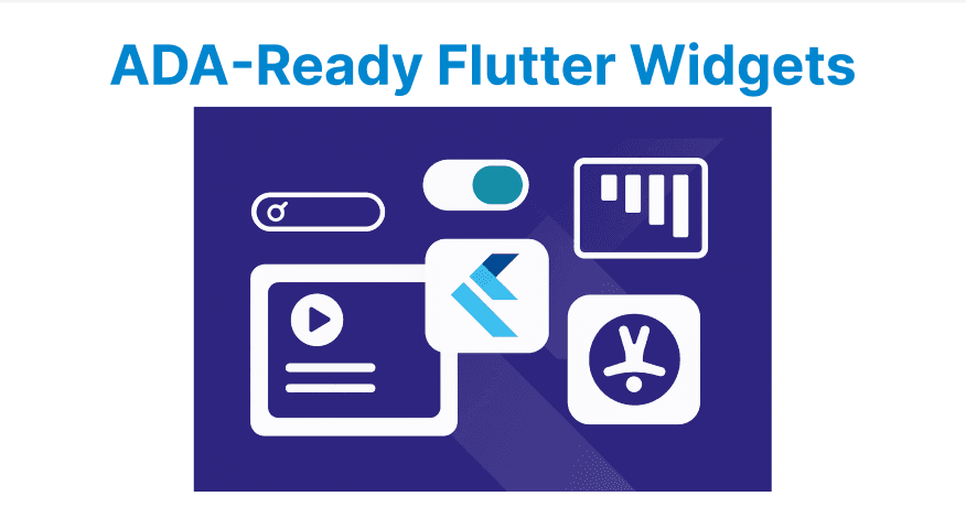
Flutter includes widgets and APIs that help developers build accessible applications. To make apps ADA-compliant, these widgets should be used correctly along with practices like adding semantic labels, enabling keyboard navigation, and supporting screen readers.
Semantics
The Semantics widget provides information about UI elements to assistive technologies such as screen readers. Without semantics, a button may only be announced as “button.” With semantics, it can be described more clearly, for example: “Submit form, double-tap to submit.”
This widget allows developers to define what an element is, what it does, and what state it is in. That way, screen reader users receive the same meaningful context that sighted users see visually.
Semantics(label: 'Submit form',hint: 'Double tap to submit',button: true,child: ElevatedButton(onPressed: () {},child: Text('Submit'),),);Focus and FocusTraversalGroup
Once widgets have semantic meaning, you need to ensure users can actually move between them without touch. That’s where Focus and FocusTraversalGroup come in.
These widgets let users navigate UI elements using a keyboard, D-pad, or remote control. They ensure that your semantics-labeled elements are not just read out, but also reachable.
So after labeling elements with Semantics, you handle how users move across them with focus management.
FocusTraversalGroup(child: Column(children: [Focus(child: TextField(),),Focus(child: ElevatedButton(onPressed: () {}, child: Text('Next')),),],),);Shortcuts and Actions
After focus navigation is working, you improve usability with shortcuts. For example, pressing Enter to activate a button or arrow keys to move between options.
Shortcuts and Actions connect keyboard input to widget behavior. This makes your app predictable for people who cannot use touch gestures
Shortcuts(shortcuts: {LogicalKeySet(LogicalKeyboardKey.enter): ActivateIntent(),},child: Actions(actions: {ActivateIntent: CallbackAction<ActivateIntent>(onInvoke: (_) => debugPrint('Enter pressed'),),},child: Focus(child: ElevatedButton(onPressed: () {}, child: Text('OK')),),),);ExcludeSemantics and MergeSemantics
Sometimes, too much information is read aloud, which confuses users. These widgets let you control how screen readers read groups of widgets.
For example, instead of “Volume icon, 80%” being read in two pieces, MergeSemantics lets it be read as “Volume 80%.” This refines the information from the Semantics so it sounds natural.
MergeSemantics(child: Row(children: [Icon(Icons.volume_up),Text('Volume 80%'),],),);Tooltip
Tooltips give extra hints. Sighted users see them on hover/focus, and screen readers announce them. For example, an icon-only trash button might be unclear, but adding a tooltip makes it read as “Delete item.” This complements semantics by adding extra clarity where visuals alone aren’t enough.
Tooltip(message: 'Delete item',child: IconButton(icon: Icon(Icons.delete),onPressed: () {},),);MediaQuery and Accessibility Settings
Users can change global accessibility preferences (large text, reduce motion, high contrast). MediaQuery allows your app to respect these preferences automatically.
For example, if someone enables larger fonts in their phone settings, your app should scale text instead of cutting it off. This ensures your app doesn’t fight user preferences.
final scale = MediaQuery.of(context).textScaleFactor;ElevatedButton, Switch, Checkbox (Pre-Built Accessible Widgets)
Flutter’s built-in Material widgets already include accessibility roles and states. For example, a Checkbox automatically tells the screen reader whether it’s checked or not.
This is the default layer of accessibility you get for free if you use Flutter’s standard widgets. But you still need to wrap them in Semantics or ListTile to give them context.
Checkbox(value: isChecked,onChanged: (val) {},)